Mapping EFSA's food consumption data with tmap
Disclaimer
The opinions expressed in the article are those of the author(s) only, and may not necessarily represent the views of EFSA or of any other EU Institution or body.
EFSA’s food consumption data
The European Food Safety Authority collects food consumption data from all EU countries and and integrates them in their database. The data is based on country specific surveys, in which individuals get interviewed about their food consumption habits. This data is used for EFSA’s risk assessments as part of the exposure assessment.
Accessing the data
The data is available from EFSA’s website http://www.efsa.europa.eu/en/food-consumption/comprehensive-database in form of Excel files.
I selected for this tutorial the file of the “Chronic food consumption statistics” - “grams per day” - “all subjects”.
The following code reads the data from the EFSA website and writes it to a local file. The file contains 4 sheets and we select the last one, which contains data on the lowest foodex level 4.
First download and cache it,
if (!file.exists("chronicgdaytotpop.xlsx"))
  download.file("http://www.efsa.europa.eu/sites/default/files/chronicgdaytotpop.xlsx","chronicgdaytotpop.xlsx")
and the read it into R. The I fix a different spelling in the data versus the shape files to be used later for the map.
data <- read_excel("./chronicgdaytotpop.xlsx","L4_All_subjects_g_day",skip=2)
names(data) <- gsub(x = names(data),
                        pattern = "[[:space:]]|[[:punct:]]",
                        replacement = "_",
                    perl = F)
data <- data %>%
  fixCountries
Description of data
The data is organised ‘per country’, ‘per survey’,’per population class’ and ‘per food group’. The food classification follows the Foodex1 standard developed by EFSA, which is a hierarchical system for classifying food. The current data set contains the most detailed foodex levels (3 and 4)
The ‘Mean’ column contains then the mean consumption in grams per day of this food among the participants of the survey. Additionally to the mean other statistics about the distribution of the food intake are given (standard deviation, percentiles)
We can interpret a single row, such as:
data %>% filter(Foodex_L4 == 'Couscous') %>%
  filter(row_number()==1) %>%
  glimpse
## Observations: 1
## Variables: 17
## $ Country <chr> "Austria"
## $ Survey <chr> "Austrian Study on Nutritional Status 2010-1...
## $ Pop_Class <chr> "Adults"
## $ Foodex_L3 <chr> "Wheat milling products"
## $ Foodex_L4 <chr> "Couscous"
## $ Metrics <chr> "A.01.000051"
## $ Nr_Subjects <dbl> 308
## $ Nr_Consumers <dbl> 7
## $ Mean <dbl> 1.280844
## $ STD <dbl> 9.331736
## $ P5 <dbl> 0
## $ P10 <dbl> 0
## $ Median <dbl> 0
## $ P95 <dbl> 0
## $ P97_5 <dbl> 0
## $ P99 <dbl> 56
## $ Comment <lgl> NAin the following way:
There was a food consumption survey with name ‘Austrian Study on Nutritional Status 2010-12 - Adults’ run in ‘Austria’. One group of ‘308’ ‘Adults’ was surveyed and the ‘Mean’ food consumption of food ‘Couscous’ in that group was ‘1.28’ g intake per day. There are some more variables for the distribution of the daily intake. Note the large standard deviation, which means that the eating habits of ‘Couscous’ various a lot.
Analysis of standart deviation
One interesting question on this data is, which food are distributed evenly, so most individuals eat them in similar proportions. One potential interpretation of those, is to say that these are the food which are ‘eaten in all of Europe, in all ages’ in the same quantities.
Lets find those with dplyr, like this:
stds <- data %>% group_by(Foodex_L4) %>%
  filter(Mean > 5) %>%
  summarise(STD=mean(STD),mean=mean(Mean)) %>%
  arrange(STD) %>%
  head(20)
knitr::kable(stds)| Foodex_L4 | STD | mean |
|---|---|---|
| Salt, iodised | 3.092542 | 6.313222 |
| Salt | 4.000443 | 8.159481 |
| Rice starch | 5.130434 | 6.681824 |
| Fructose | 5.279714 | 6.063511 |
| Oil, frying, blend | 6.041108 | 6.292762 |
| Cocoa powder | 6.304501 | 6.495044 |
| Jelly candies | 6.926092 | 5.243410 |
| Margarine and similar products | 7.385982 | 7.290324 |
| Cream 40 % fat | 7.488790 | 6.402034 |
| Parsley root (Petroselinum crispum) | 7.644194 | 11.049928 |
| Duck meat (Anas spp.) | 7.887929 | 5.294000 |
| Tomato ketchup | 7.911607 | 5.703227 |
| Coffee beans, roasted and ground | 8.036786 | 7.561675 |
| Cooked sausage | 8.102821 | 5.397307 |
| Cheese, Parmigiano Reggiano | 8.367041 | 7.220518 |
| Salad dressing, 25 - 50% oil | 8.407296 | 5.696910 |
| Breadcrumbs | 8.685303 | 6.797546 |
| Spring onions, bulb (Allium cepa) | 8.739136 | 5.635335 |
| Plaice (Pleuronectes) | 8.758317 | 5.157403 |
| Jam, Raspberries (Rubus idaeus) | 8.949646 | 8.119948 |
So it seems that all Europeans agree on eating similar portions of :
- salt
- rice starch
- fructose
- Oil
- Cream
- tomato ketchup
- coffee
- cooked sausage
and others.
Prepare data for mapping
For mapping purposes we can now decide which food group we want to use, ‘Jam’ in this case, and need to decide, how to aggregate the data of the different surveys and population groups. In this case I take the most simple approach, which is to average over all surveys and population groups.
This is good enough for illustrative purposes, but a exposure assessment based on this data needed to find a more sophisticated strategy in order to consider methodological differences between the studies.
A more detailed explained on how to use this data, see EFSA’s website.2
jam <- data %>% filter(Foodex_L4=='Jam') %>%
  group_by(Country) %>%
  summarise(food_mean=mean(Mean,na.rm = T))
The data is now in a format, ready to be presented in a pan European map, having a single value per country.
knitr::kable(jam)| Country | food_mean |
|---|---|
| Austria | 5.2262848 |
| Belgium | 7.3638807 |
| Bulgaria | 0.0318451 |
| Cyprus | 0.9350935 |
| Czech Rep. | 3.6384642 |
| Denmark | 0.0000000 |
| Finland | 1.3505814 |
| France | 6.2648030 |
| Germany | 5.7111286 |
| Greece | 0.6074363 |
| Hungary | 0.0000000 |
| Ireland | 0.1185676 |
| Italy | 1.7422288 |
| Latvia | 1.7141950 |
| Netherlands | 4.5594901 |
| Romania | 3.9689273 |
| Spain | 0.4005222 |
| Sweden | 3.0928232 |
| United Kingdom | 1.1951599 |
For this tutorial we will use the tmap package. It comes already with a shape file of Europe. First we will restrict it to EU countries:
Europe.eu <- Europe[Europe$EU_Schengen %in% c("EU Schengen","EU Schengen cand.",
                                              "EU Non-Schengen"),]
The tmap library allows to append this data easily to an existing European shape file, by using the ‘append_data’ function.
As the spelling of ‘Czech Republic’ in the data does not match the shape file, we rename it here.
jam <- jam %>%
  ungroup() %>%
  mutate(Country=ifelse(Country=='Czech Republic','Czech Rep.',Country))
Europe.jam <- append_data(Europe.eu,as.data.frame(jam),key.shp = 'name',key.data = "Country")
Europe.jam$income_grp <- as.character(Europe.jam$income_grp)
write_shape(Europe.jam,"europe_jam.shp")
zip("europe_jam_shp.zip",dir(".","europe_jam.*"))
The ‘key.shp’ and ‘key.data’ parameter specify, on which columns the data and the shape file should be joined.
Showing a pan european map of food consumption data
A simple map of one food item
The data can now be shown on the screen as a simple map, containing one layer which represents the mean food consumption of ‘jam’, where the quantity is represented as color of the country polygon, increasing the level of darkness of the color by increased consumption.
tm_shape(Europe.jam) +
  tm_polygons(col='food_mean',title = "Jam consumption (mg/day)") +
  tm_format_Europe_wide()
This map show, that France and Germany seems to be the top Jam consumers.
A more advanced map
We can easily add extra information to the map, like the ISO code of the countries, which are in column ‘iso_a3’ of the shape file. We do this by adding a text layer with ‘tm_text’, specifying which column of the shape file contains the textual information to show.
tm_shape(Europe.jam) +
  tm_polygons(col='food_mean',title = "Jam consumption (mg/day)") +
  tm_text('iso_a3',size = .5,
          col = "black",
         bg.color = "white") +
    tm_format_Europe_wide()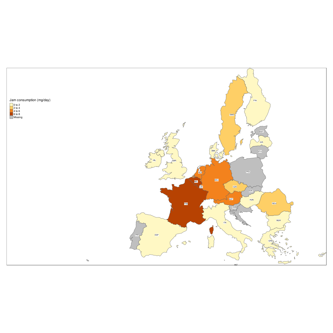
Showing multiple maps
The following code shows one of the strength of using tmap, which is the very easy creation of multiple maps. Let’s see how to show 4 maps, each with a different food.
First we filter the data by the 4 foods, and then we transform it from ‘long’ to ‘wide’ format with the ‘tidyr’ packages.
food_data <- data %>%
  collect %>%
  filter(Foodex_L4 %in% c('Wheat grain','Jam','Couscous','Dried fruits')) %>%
  group_by(Country,Foodex_L4) %>%
  summarise(food_mean=mean(Mean,na.rm = T))

food_data <- food_data %>%
  spread("Foodex_L4",'food_mean') %>%
  ungroup() %>%
  mutate(Country=ifelse(Country=='Czech Republic','Czech Rep.',Country))
This results in a table, which has one column per food:
knitr::kable(food_data)| Country | Couscous | Dried fruits | Jam | Wheat grain |
|---|---|---|---|---|
| Austria | 0.2876738 | 0.1139407 | 5.2262848 | 0.0000000 |
| Belgium | 0.5355902 | 0.0032250 | 7.3638807 | 0.0000000 |
| Bulgaria | 0.0000000 | 0.0000000 | 0.0318451 | 0.0826588 |
| Cyprus | 0.0000000 | 0.0000000 | 0.9350935 | 0.0000000 |
| Czech Rep. | 0.0000000 | 0.2356088 | 3.6384642 | 0.0000000 |
| Denmark | 0.0000000 | 0.0000000 | 0.0000000 | 0.0001695 |
| Finland | 0.0303171 | 0.0333622 | 1.3505814 | 0.0000000 |
| France | 4.6042196 | 0.0000000 | 6.2648030 | 1.2603470 |
| Germany | 0.0124737 | 0.1177921 | 5.7111286 | 0.0356976 |
| Greece | 0.0000000 | 0.0000000 | 0.6074363 | 0.0000000 |
| Hungary | 0.0000000 | 0.0000000 | 0.0000000 | 0.0000000 |
| Ireland | 0.1457767 | 0.2361331 | 0.1185676 | 0.0000000 |
| Italy | 0.0589026 | 0.0006176 | 1.7422288 | 0.0000000 |
| Latvia | 0.0000000 | 0.5121008 | 1.7141950 | 0.0000000 |
| Netherlands | 0.0629168 | 0.0725512 | 4.5594901 | 0.0069556 |
| Romania | 0.0355434 | 0.0000000 | 3.9689273 | 0.0018987 |
| Spain | 0.0000000 | 0.0129597 | 0.4005222 | 0.0000000 |
| Sweden | 0.2039704 | 0.2110512 | 3.0928232 | 0.0230651 |
| United Kingdom | 0.5319579 | 0.1647893 | 1.1951599 | 0.0044839 |
This new data frame will be merged with the shape file
Europe.4foods <- append_data(Europe.eu,as.data.frame(food_data),key.shp = 'name',key.data = "Country")and then be plotted as 4 maps, by just using a vector with the column names in the ‘col’ argument of tm_polygons. This will plot one map for each column name in the vector.
tm_shape(Europe.4foods) +
  tm_polygons(col=c('Jam','Wheat grain','Couscous','Dried fruits'),n=3) +
  tm_format_Europe(legend.position = c("left","top"))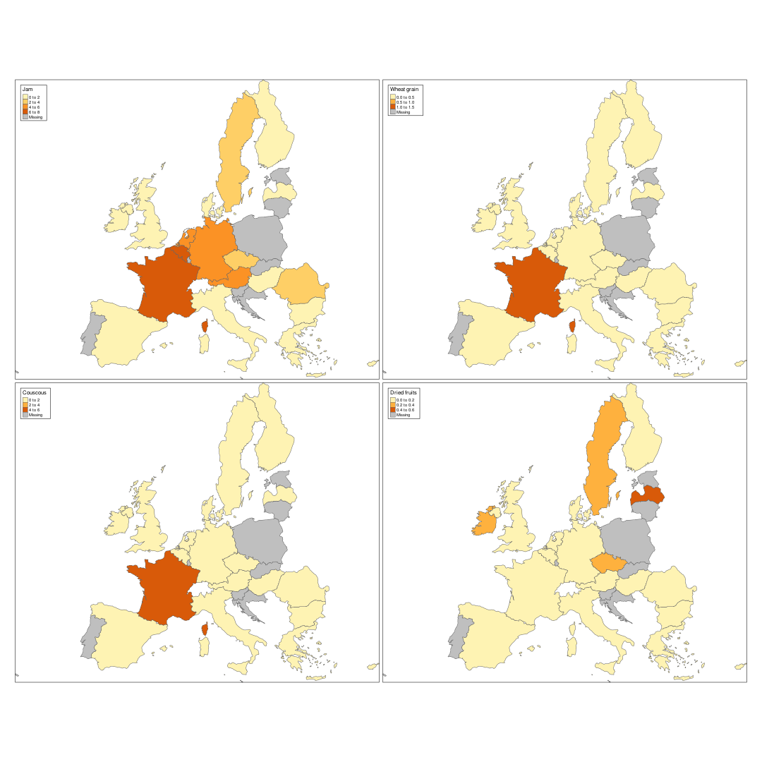
Map of people surveyed
An other type of information which can be extracted from the data set, is information about the food consumption surveys. The following code counts the number of individuals, which were surveyed per country. In case of various surveys, I just sum it up.
peopleSurveyed <- data %>%
  group_by(Survey,Pop_Class) %>%
  filter(row_number()==1) %>%
  select(Country,Survey,Nr_Subjects,Pop_Class) %>%
  group_by(Country) %>%
  summarise(numSubjects=sum(Nr_Subjects))


kable(peopleSurveyed)| Country | numSubjects |
|---|---|
| Austria | 765 |
| Belgium | 3744 |
| Bulgaria | 1720 |
| Cyprus | 303 |
| Czech Rep. | 2353 |
| Denmark | 8563 |
| Finland | 7482 |
| France | 4079 |
| Germany | 16875 |
| Greece | 903 |
| Hungary | 1360 |
| Ireland | 2458 |
| Italy | 3323 |
| Latvia | 2913 |
| Netherlands | 6587 |
| Romania | 1382 |
| Spain | 2909 |
| Sweden | 5498 |
| United Kingdom | 7480 |
This can be plotted as a bar chart, to compare easily the number of individuals surveyed. As we can see, there are large differences between them. Some Nordic countries have each surveyed more then 5000 individuals, while others have below 1000.
ggplot(peopleSurveyed) +
  geom_bar(aes(x = reorder(Country,numSubjects),
               y = numSubjects),
           stat = 'identity'
          ) +
  coord_flip()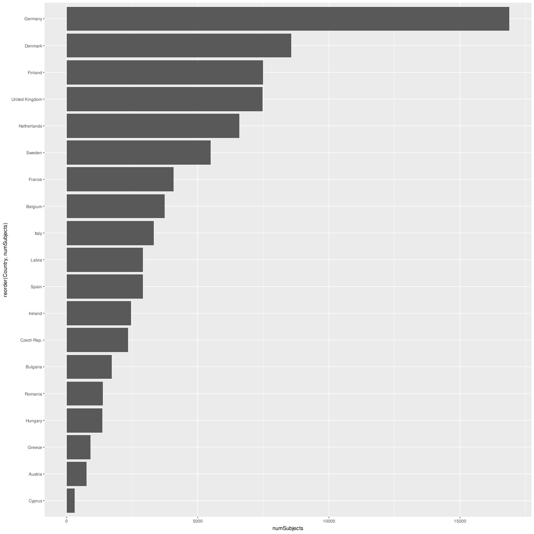
The same data shown as map shows a rather clear difference between north and southern Europe. Does this mean that the (richer) Nordic countries invest more money in food consumption surveys ? Or is it related to population (only) ?
A first hint to this question is to look at number of individuals together with GDP and population of a country.
Europe.surveyed <- append_data(Europe.eu,peopleSurveyed,key.shp = 'name',key.data = "Country")
tm_shape(Europe.surveyed) +
  tm_polygons("numSubjects",n = 10,title = "# individuals") +
tm_shape(Europe.surveyed) +
  tm_bubbles(col = 'pop_est',
             size = "gdp_cap_est",
             title.col = 'Population estimated',
             title.size = "GDP estimated",
             palette = "Blues",
             contrast = c(0.5,1),
             n = 5) +
  tm_format_Europe_wide()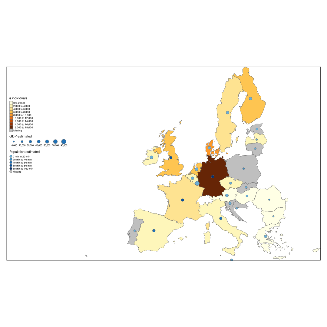
Who eats most vegetables ?
By filtering data dependent on the highes L1 foodex level, we can get an glimpse on meat vs. non meat consumption in Europe.
tmap_mode("plot")

data.l1 <- read_excel("./chronicgdaytotpop.xlsx","L1_All_subjects_g_day",skip=2) %>%
  tbl_df() %>%
  fixCountries


data.veg <- data.l1 %>% filter(!`Foodex L1` %in%
                                 c("Meat and meat products (including edible offal)",
                                   "Fish and other seafood (including amphibians, rept",
                                   "Milk and dairy products","Eggs and egg products",
                                   "Animal and vegetable fats and oils"))

veg.country <- data.veg %>% group_by(Country) %>% summarize(mean=mean(Mean)) %>% arrange(mean)
Europe.eu.veg <- append_data(Europe.eu,veg.country,key.shp = "name",key.data = "Country")
tm_shape(Europe.eu.veg) +
tm_polygons(col='mean',palette='Greens',n = 10)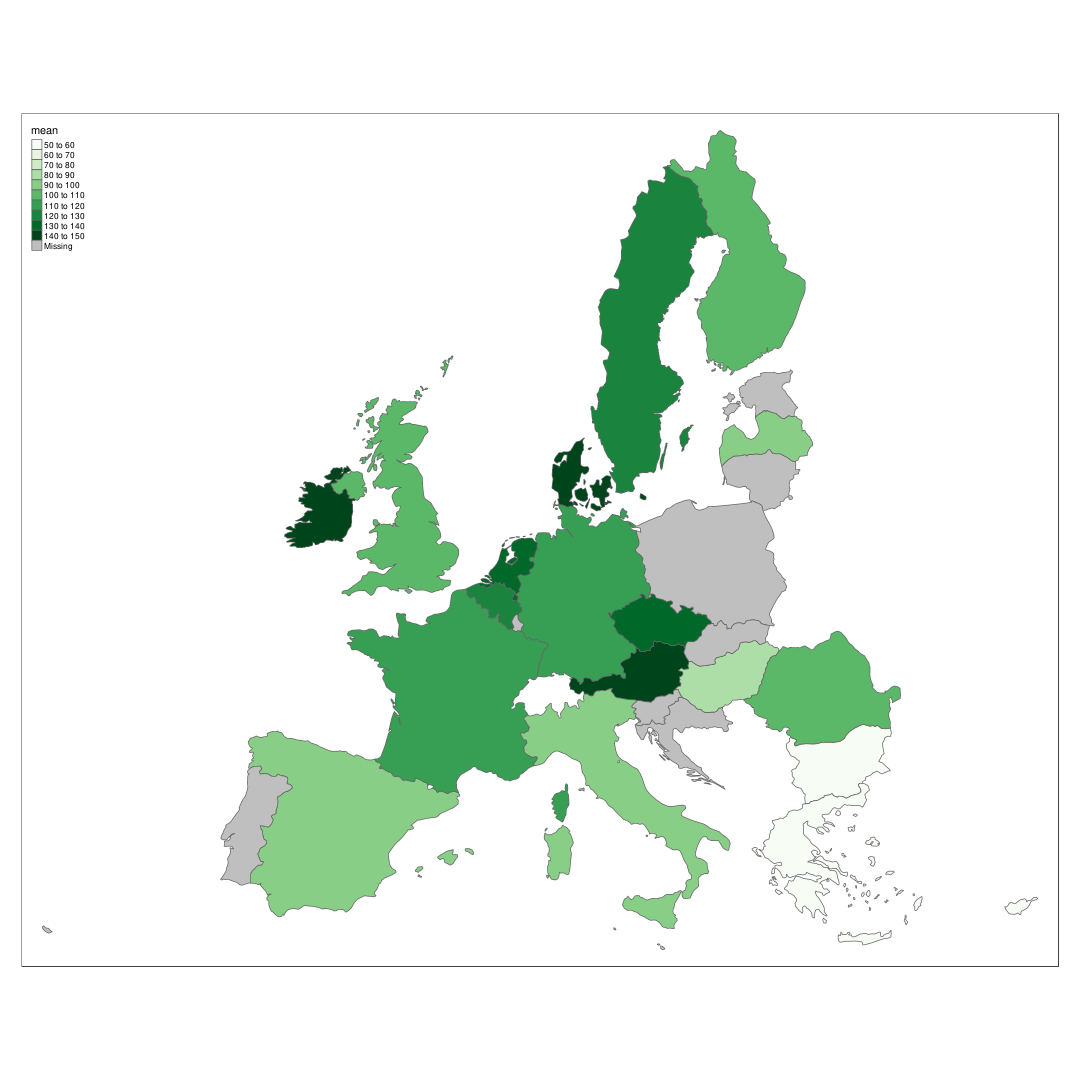
Interactive map
Tmap has as well an interactive mode. To demonstrate it, we will now add two layers we have used before,’Jam consumption’ and ‘# individuals surveyed’ to the same interactive map.
In such a map the user can:
- change background (online) map
- zoom and drag the mp
- select layers to see (Jam consumption,#individuals)
- click on countries to see all information for this country in the shape file
tmap_mode("view")
tm_shape(Europe.jam) +
  tm_polygons(col = 'food_mean',title = "Jam consumption (mg/day)") +
tm_shape(Europe.surveyed) +
  tm_polygons("numSubjects",n = 10,title = "# individuals",palette="Blues") +
  tm_format_Europe_wide()
As this blog is done with knitr, the interactive map is not shown.
Session info
The following R library versions were used for this tutorial.
sessionInfo()## R version 3.4.1 (2017-06-30)
## Platform: x86_64-pc-linux-gnu (64-bit)
## Running under: Arch Linux
##
## Matrix products: default
## BLAS: /usr/lib/libblas_nehalemp-r0.2.19.so
## LAPACK: /usr/lib/liblapack.so.3.7.1
##
## locale:
## [1] LC_CTYPE=en_US.UTF-8 LC_NUMERIC=C
## [3] LC_TIME=en_US.UTF-8 LC_COLLATE=en_US.UTF-8
## [5] LC_MONETARY=en_US.UTF-8 LC_MESSAGES=en_US.UTF-8
## [7] LC_PAPER=en_US.UTF-8 LC_NAME=C
## [9] LC_ADDRESS=C LC_TELEPHONE=C
## [11] LC_MEASUREMENT=en_US.UTF-8 LC_IDENTIFICATION=C
##
## attached base packages:
## [1] methods stats graphics grDevices utils datasets
## [7] base
##
## other attached packages:
## [1] bindrcpp_0.2 tmaptools_1.2-1 pander_0.6.1
## [4] readxl_1.0.0 knitr_1.17 dplyr_0.7.3.9000
## [7] purrr_0.2.3 readr_1.1.1 tidyr_0.7.1
## [10] tibble_1.3.4.9001 ggplot2_2.2.1 tidyverse_1.1.1
## [13] tmap_1.10
##
## loaded via a namespace (and not attached):
## [1] nlme_3.1-131 bitops_1.0-6 sf_0.5-4
## [4] satellite_1.0.0 lubridate_1.6.0 httr_1.3.1
## [7] webshot_0.4.1 gmodels_2.16.2 RColorBrewer_1.1-2
## [10] mapview_2.1.4 tools_3.4.1 rgdal_1.2-10
## [13] R6_2.2.2 KernSmooth_2.23-15 lazyeval_0.2.0
## [16] rgeos_0.3-23 DBI_0.7 colorspace_1.3-2
## [19] raster_2.5-8 sp_1.2-5 tidyselect_0.2.0
## [22] mnormt_1.5-5 leaflet_1.1.0 curl_2.8.1
## [25] compiler_3.4.1 rvest_0.3.2 expm_0.999-2
## [28] xml2_1.1.1 labeling_0.3 scales_0.5.0
## [31] rmapshaper_0.3.0 classInt_0.1-24 psych_1.7.8
## [34] stringr_1.2.0 digest_0.6.12 foreign_0.8-69
## [37] R.utils_2.5.0 base64enc_0.1-3 dichromat_2.0-0
## [40] pkgconfig_2.0.1 htmltools_0.3.6 highr_0.6
## [43] jsonvalidate_1.0.0 htmlwidgets_0.9 rlang_0.1.2
## [46] shiny_1.0.5 bindr_0.1 jsonlite_1.5
## [49] crosstalk_1.0.0 gtools_3.5.0 spdep_0.6-15
## [52] R.oo_1.21.0 RCurl_1.95-4.8 magrittr_1.5
## [55] geosphere_1.5-5 Matrix_1.2-11 Rcpp_0.12.12
## [58] munsell_0.4.3 R.methodsS3_1.7.1 stringi_1.1.5
## [61] MASS_7.3-47 plyr_1.8.4 grid_3.4.1
## [64] parallel_3.4.1 gdata_2.18.0 forcats_0.2.0
## [67] udunits2_0.13 deldir_0.1-14 lattice_0.20-35
## [70] haven_1.1.0 splines_3.4.1 hms_0.3
## [73] pillar_0.0.0.9000 boot_1.3-20 gdalUtils_2.0.1.7
## [76] geojsonlint_0.2.0 reshape2_1.4.2 codetools_0.2-15
## [79] stats4_3.4.1 LearnBayes_2.15 osmar_1.1-7
## [82] servr_0.7 XML_3.98-1.9 glue_1.1.1
## [85] evaluate_0.10.1 V8_1.5 modelr_0.1.1
## [88] png_0.1-7 httpuv_1.3.5 foreach_1.4.3
## [91] cellranger_1.1.0 gtable_0.2.0 assertthat_0.2.0
## [94] mime_0.5 xtable_1.8-2 broom_0.4.2
## [97] e1071_1.6-8 coda_0.19-1 class_7.3-14
## [100] viridisLite_0.2.0 iterators_1.0.8 units_0.4-6